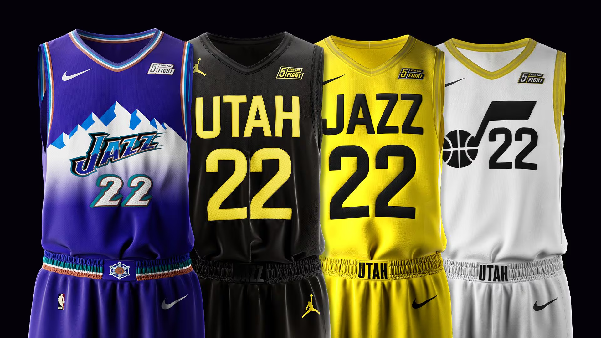
On Thursday, the Utah Jazz announced a revamp to their jerseys and logos. Their four new jerseys are a modern take on the classic “mountain” jerseys that many consider to be some of, if not the best classic NBA jersey of all time. First introduced for the 1996/1997 season, the classic white home and purple road “mountain” jerseys would be their main jerseys until the end of the 2003/2004 season.
Utah would bring the classic version of the jersey or variations of the jerseys several times throughout the years, with the classic road jersey being brought back for the 2019/2020 and 2022/2023 seasons, and an all-purple take of the jersey being used for the team’s City Edition jersey this season. Since the introduction of new jerseys for the 2004/2005 season, many have argued Utah has had some of the worst jerseys since then.
Utah’s current jerseys will be worn through the 2024/2025 season, with one of the four jerseys announced being the City Edition for the 2024/2025 season. The new Icon and Association jerseys will start being used during the 2025/2026 season and the black Statement Edition jersey will start being worn on occasion starting after the beginning of 2025.
For about the last decade, the NBA has had a problem not only with their jerseys, but logos as well. Over time, redesigns have not only lost their creativity but have become more simplistic with each new redesign. Two notable examples of this are the Detroit Pistons and Toronto Raptors.
Another highly regarded logo and Jersey amongst NBA fans, the Pistons introduced their classic teal Pistons logo and jerseys, which saw a few color changes over time, but the jerseys would last until the end of the 2000/2001 season and the logo would last until the end of the 2004/2005 season. Since then, the jerseys and logos have become more simplistic, with the classic teal jersey only being brought back once for the 2022/2023 season.
Regarded as one of the best NBA jerseys and logos of all time, the first Toronto Raptors jersey and logo was the definition of the 1990s. The original jersey featuring the Raptors logo only lasted from the team’s first season in 1995 to the 1998/1999 season. The team would keep the same colors with their new jerseys that would last until the 2005/2006 season. The classic Raptors logo would be the team’s main logo from the 1995/1996 season until the end of the 2014/2015 season. Since then, the team has introduced a more simplistic logo featuring claws on a basketball. Toronto would bring the jerseys back for the 2014/2015 and 2019/2020 seasons, as well as using an OVO-inspired variant for the 2021/2022 season.
With this more simplistic change happening in the NBA, the Jazz have not only been able to look to the past but have a modern take on the past jerseys to fit in today’s NBA. The Icon and Association jerseys set to debut in the 2025/2026 season closely resemble the classic “mountain” jerseys with slight tweaks, mainly a more modern take on the mountains used in the logo. Using a color combination including blue, purple, and white, the Jazz is one of only a handful of teams using a unique set of colors.
The announcement of the new Jazz Jerseys and logos has shown that there is a need for more creativity and less simplicity in the NBA. Many of the home and away jerseys in the modern NBA do not feature a big logo, just the name of the team or city plastered across the chest. With the purple and white jerseys taking over as the home-away jerseys in the 2025/2026 seasons, the Jazz could start a movement towards more unique and creative jerseys.
Author Profile
Latest entries
 NBAApril 5, 2026NBA Swing: Making the Case for Every MVP Contender
 NBAMarch 28, 2026NBA Swing: What the First Pick Would Mean for Every Bottom-10 Team
 NBAMarch 21, 2026NBA Swing: The Biggest Questions Surrounding Expansion
 NBAMarch 14, 2026NBA Swing: Five Awards That Should Be Handed Out


