Photo Credit: NHL.com
 0
 0
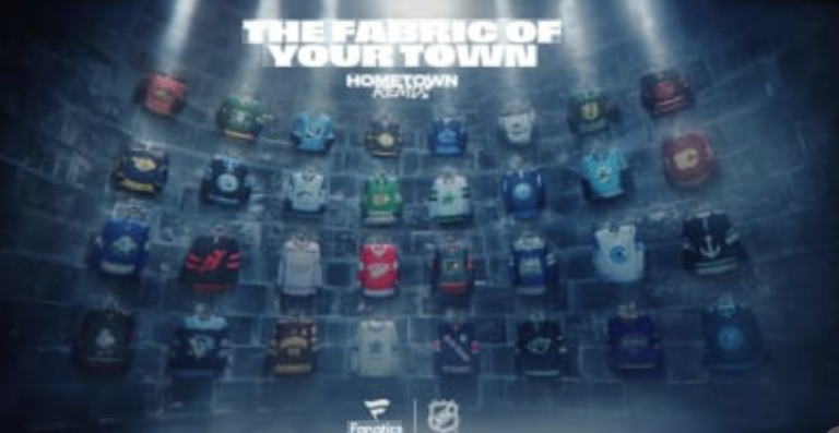
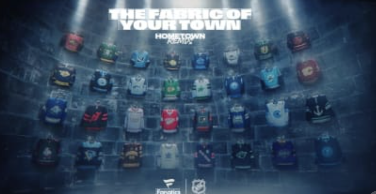
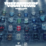
The NHL has officially unveiled its newest alternate jerseys, and hockey fans have plenty to discuss. On November 2, the league and Fanatics introduced the Hometown Remix collection for all 32 franchises. Each design celebrates its team’s city, culture, history, or local traditions. The collection follows similar uniform programs across professional sports, including MLB’s City Connect jerseys. However, some teams embraced bold creativity, while others favored familiar designs with subtle changes. The NHL plans to feature these uniforms during 261 games throughout the 2026-27 season.
Additionally, 19 matchups will feature both teams wearing their new alternate jerseys. The Florida Panthers, Chicago Blackhawks, and San Jose Sharks will debut their uniforms on November 2. Every jersey brings something different, but not every design deserves the same praise. These rankings consider creativity, color combinations, team identity, local connections, and overall appearance. Most importantly, the rankings reflect design preferences rather than team success or popularity.
The Rankings: Best to Worst
1\. Anaheim Ducks
Anaheim takes the top spot with a spectacular combination of green, purple, and gold. The design recalls the franchise’s Mighty Ducks history while embracing Orange County’s personality. Additionally, the familiar duck-mask logo makes this jersey instantly recognizable. This uniform combines nostalgia, creativity, and outstanding colors better than anything else in the collection.
2\. Florida Panthers
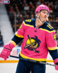
Florida deserves tremendous credit for embracing South Florida’s tropical atmosphere. The sunrise-inspired colors and retro Panthers crest create a refreshing appearance. Furthermore, the jersey captures the region’s beach culture without abandoning the franchise’s identity. This design should look spectacular under arena lighting.
3\. Los Angeles Kings
The Kings finally give their fans another beautiful purple uniform. Hollywood-inspired lettering and subtle palm-tree details celebrate Los Angeles without overwhelming the design. Additionally, the jersey honors six decades of franchise history. Purple remains one of hockey’s most underrated uniform colors.
4\. New York Islanders
The Islanders revive their famous Fisherman design with a modern approach. The updated crest, ocean-inspired striping, and lighthouse shoulder patches celebrate Long Island’s maritime culture. Furthermore, the jersey demonstrates how a controversial historical design can become a modern favorite.
5\. Tampa Bay Lightning
Tampa Bay brings back the skull design from its Stadium Series history. The black foundation and sky-blue accents create a menacing appearance. Additionally, the lightning-bolt sleeves provide excellent visual contrast. The Bayshore Balustrade detail adds a meaningful local connection. This ranks among Tampa Bay’s most adventurous uniforms.
6\. Winnipeg Jets
Winnipeg celebrates the northern lights with a beautiful gradient design. The combination of dark blue and green captures Manitoba’s winter skies. Meanwhile, the glowing visual effects create something completely different from traditional hockey uniforms. This jersey succeeds because its inspiration immediately makes sense.
7\. Colorado Avalanche
Colorado embraces the Rocky Mountains with an elegant blue-and-white uniform. The mountain-elevation patterns provide interesting details without dominating the design. Furthermore, metallic silver accents create a frozen appearance. The state-inspired crest gives the jersey a distinctive identity.
8\. Buffalo Sabres
Buffalo brings back its popular Goathead logo with a blue-and-gold makeover. The result combines two recognizable periods of Sabres history. Additionally, lightning-inspired details celebrate Buffalo’s City of Light nickname. The bold crest makes this one of the collection’s strongest traditional designs.
9\. Minnesota Wild
Minnesota’s black-and-green combination creates a dramatic appearance. The crescent moon and constellation details celebrate the state’s northern landscape. However, the colors also resemble those of the Dallas Stars. Despite that similarity, the overall design deserves a top ten ranking.
10\. Seattle Kraken
Seattle embraces its maritime heritage with an anchor-centered uniform. The nautical artwork and Mount Rainier details create a meaningful regional connection. Additionally, the distinctive typography gives the jersey an authentic historical personality. The design offers creativity without becoming unnecessarily complicated.
11\. Philadelphia Flyers
Philadelphia celebrates the Liberty Bell and America’s 250th anniversary. The historical references create one of the collection’s strongest hometown connections. Furthermore, the cracked-number details provide a clever finishing touch. The design deserves recognition for its creativity, even if its appearance divides fans.
12\. Calgary Flames
Calgary honors the Saddledome during its final season as the Flames’ home. The red-and-gold design incorporates architectural details from the famous arena. Additionally, the jersey recognizes an important chapter in franchise history. Its emotional significance elevates an otherwise traditional appearance.
13\. New York Rangers
The Rangers celebrate New York through Lady Liberty and architectural inspiration. Their staircase-style lettering creates a noticeable departure from traditional Rangers uniforms. Meanwhile, the silver detailing provides a polished appearance. The jersey looks attractive, although the chest design takes some adjustment.
14\. Pittsburgh Penguins
Pittsburgh embraces pop art through an imaginative redesign of its familiar penguin logo. The halftone textures and colorful details create a distinctive appearance. Additionally, references to the former Civic Arena celebrate franchise history. The concept works, although its unusual graphics might divide traditionalists.
15\. St. Louis Blues
St. Louis introduces black while celebrating the Mississippi River and Gateway Arch. The wave-inspired detailing creates a strong connection to the city. Furthermore, the updated musical-note crest maintains the franchise’s identity. However, the darker appearance sacrifices some of the team’s familiar blue personality.
16\. San Jose Sharks
San Jose celebrates its famous Shark Tank entrance with an aggressive new design. The bright blue foundation and shark-tooth striping create an energetic appearance. Additionally, the prominent SJ crest provides a recognizable focal point. The design works well, although the traditional shark logo remains superior.
17\. Edmonton Oilers
Edmonton introduces a black, oil-inspired uniform with striking orange accents. The industrial theme reflects the city’s energy heritage. Furthermore, the returning oil-worker shoulder patch adds historical character. However, the darker design feels less distinctive than Edmonton’s traditional blue-and-orange combinations.
18\. Vegas Golden Knights
Vegas embraces casino culture through card suits, roulette patterns, and gold detailing. The concept fits the city’s entertainment identity perfectly. Additionally, the casino-inspired shoulder treatment adds an interesting visual element. However, the jersey risks becoming too busy with its numerous decorative features.
19\. Toronto Maple Leafs
Toronto celebrates a century of Maple Leafs history through a clean, traditional appearance. The vintage-inspired crest and subtle leaf patterns offer meaningful historical connections. Furthermore, the uniform maintains the franchise’s unmistakable identity. However, it lacks the creativity that makes several other designs memorable.
20\. Montreal Canadiens
Montreal celebrates its cultural heritage through floral symbols and architectural details. The jersey honors Quebec’s history while maintaining the Canadiens’ recognizable appearance. Additionally, the decorative elements demonstrate thoughtful craftsmanship. However, Montreal’s classic uniforms remain difficult to improve.
21\. Utah Mammoth
Utah introduces a creative design featuring its prominent tusk logo. The shoulder and sleeve patterns create a larger tusk silhouette. Furthermore, the mountain-inspired detailing reflects Utah’s geography. The jersey has potential, although the franchise’s regular colors already provide an excellent foundation.
22\. Nashville Predators
Nashville celebrates country music and traditional stagewear through decorative filigree. The detailed crest and sleeves create a distinctive regional appearance. Additionally, the custom lettering reinforces the musical inspiration. However, the elaborate artwork might overwhelm the jersey’s overall design.
23\. Boston Bruins
Boston returns to its historical brown-and-gold roots with a college-inspired uniform. The varsity lettering and vintage details celebrate the city’s hockey traditions. Furthermore, the Freedom Trail references provide a thoughtful local connection. However, the brown foundation lacks the visual excitement of Boston’s familiar black-and-gold appearance.
24\. Chicago Blackhawks
Chicago takes a considerable risk by introducing a bright green uniform. The design incorporates elements from the city’s flag and civic history. Additionally, the unusual color creates immediate attention. However, green feels disconnected from the franchise’s familiar red, black, and white identity.
25\. Detroit Red Wings
Detroit celebrates its Hockeytown reputation with prominent lettering across the chest. The familiar winged-wheel logo and purple octopus detail honor the franchise’s history. However, the design struggles to improve upon one of hockey’s most recognizable traditional uniforms. Sometimes, simplicity remains the better choice.
26\. Washington Capitals
Washington embraces the nation’s capital through monument-inspired artwork. The Capitol Dome crest and marble textures create meaningful historical connections. Furthermore, the returning screaming-eagle shoulder patches offer a welcome nostalgic element. However, the design feels overly complicated compared with Washington’s stronger historical uniforms.
27\. Ottawa Senators
Ottawa introduces metallic gold and architectural details inspired by the city’s Gothic buildings. The bilingual shoulder patches provide a thoughtful Canadian connection. However, the overall appearance lacks the excitement of several competing designs. The Senators’ traditional red, black, and gold combination remains difficult to beat.
28\. Dallas Stars
Dallas embraces its illuminated skyline with a white, black, and green uniform. The neon-inspired graphics provide an interesting connection to the city’s nightlife. However, the design lacks the visual impact of Dallas’ stronger green uniforms. The Stars had an opportunity to create something more distinctive.
29\. Columbus Blue Jackets
Columbus features its famous goal cannon prominently across a gray uniform. The concept celebrates one of the franchise’s most recognizable arena traditions. Additionally, the Fifth Line references honor its passionate supporters. However, the gray foundation and oversized cannon make the design less appealing.
30\. New Jersey Devils
New Jersey introduces an updated Devils crest without its traditional enclosing circle. The red-and-black combination maintains the franchise’s identity. However, the overall design offers relatively little excitement. The familiar colors work, but the uniform struggles to distinguish itself from previous Devils jerseys.
31\. Vancouver Canucks
Vancouver introduces a dark, stealth-inspired uniform featuring its familiar orca. The silver eyes and skyline details celebrate the city’s nighttime appearance. However, the darker colors make the design feel less energetic. The Canucks possess a strong visual identity, and this uniform does not fully capitalize on it.
32\. Carolina Hurricanes
Carolina finishes last despite introducing one of the collection’s most creative concepts. The Hurricanes place their mascot, Stormy, prominently across the jersey. The gray foundation and local references celebrate Raleigh’s identity. However, the cartoon mascot creates an appearance better suited for promotional merchandise than NHL competition. The concept deserves credit for originality, but the execution falls short.
Did the NHL Get Its New Jerseys Right?
The NHL deserves recognition for giving every franchise an opportunity to celebrate its hometown. Several organizations delivered outstanding results, particularly Anaheim, Florida, Los Angeles, and the New York Islanders. Meanwhile, Tampa Bay created an exciting design by combining familiar franchise elements with fresh colors. However, other organizations struggled to balance creativity with traditional hockey aesthetics. Carolina’s mascot-centered uniform represents the biggest gamble. Meanwhile, Vancouver and New Jersey missed opportunities to create more memorable appearances. The collection also demonstrates the importance of local identity.
Calgary honors the Saddledome, while Philadelphia celebrates American history. Winnipeg embraces the northern lights, and Minnesota celebrates its winter landscape. Those details make the jerseys more meaningful than ordinary alternate uniforms. Still, creativity alone does not guarantee an attractive design. Some teams incorporated too many decorative elements, while others failed to move beyond familiar appearances. Ultimately, Anaheim takes the top ranking because its uniform combines nostalgia, distinctive colors, and recognizable franchise identity. Florida follows closely with a design that perfectly captures South Florida’s personality. Hockey fans will undoubtedly disagree with several placements, especially regarding their favorite teams. That debate makes uniform rankings entertaining. The NHL has given fans 32 new designs to discuss throughout the 2026-27 season. Now, the league gets to see which jerseys become fan favorites and which eventually disappear into uniform history.



Author Profile

-
Bradley Walker (VP) and Head of our Florida operations for NGSC Sports, bringing extensive experience across collegiate, professional, and amateur athletics. His coverage spans USF Athletics, including football, baseball, lacrosse, and softball, as well as University of Tampa baseball.
Bradley also provides coverage of minor league baseball with the Clearwater Threshers and Major League Baseball with the Tampa Bay Rays. On the national stage, he covers college football bowl games and conference championship matchups, along with premier golf events across the PGA Tour, LIV Golf, and LPGA Tour.
In addition to his reporting work, Bradley is the play-by-play announcer for Pinellas Park High School Patriots football, lending his voice and insight to Friday night lights.
He is also an active podcast host and contributor, serving as a host on The Walker Report, where he delivers in-depth sports analysis, interviews, and coverage across multiple levels of competition.
Latest entries
 NCAABNovember 3, 2026 at 12:12 amUSF Basketball Sweeps Home Openers in Dominant Fashion
 NHLNovember 3, 2026 at 12:12 amNHL Hometown Remix Jerseys 2026: All 32 Teams Ranked
 WWENovember 3, 2026 at 12:12 amWWE Crown Jewel 2026: Champions Collide in Saudi Arabia
 MLBNovember 3, 2026 at 12:12 am2026 MLB Gold Glove Winners: Baseball’s Defensive Stars Shine
About the Author